The Private School Annual Report: A Deep Dive
/(Updated July, 2022)
You can hear the sigh of relief on July 1 each year as the Development Office closes its fiscal year. You can also hear the jubilation if they made (or better yet, exceeded) their goals for annual giving. Yay, Team!
As the summer moves on, the office is tallying, accounting, and cross-checking making sure the numbers are right in preparation for closing the books on the year and getting ready for the annual report.
There's a lot of pressure on the Development Office to get it right. Numbers don't lie and omitting a donor or spelling their name wrong in a publication can have big consequences for the school's future fundraising. Their office has good reason to sweat it out.
The Marketing Office has a big stake in the game as well. Everyone wants the report to be perfect and to do what it's supposed to do: thank, celebrate and motivate.
So what do we know about this major project and how can we make it better by getting the report read, motivating your generous donors to give again, and encouraging them to give more?
What to Call It
I see it all: Report of Gifts/Giving, Annual Report, Annual Report of Gifts, Donor Recognition, President’s Report, Philanthropy Report, Donor Impact Report, Roll of Donors, Roll of Benefactors, and more.
The most common titles are Annual Report and Report of Gifts, and I think there’s a distinction between the two. A Report of Gifts is more “just the facts, ma’am” and lists the donors to the fund. An Annual Report has donor lists, but also more detailed financials and a “year in review” aspect to it that includes photos, sidebars, and features of the highlights of the last year.
Some of the more creative titles I’ve seen include:
Report of Appreciation (Holderness)
Impact of Giving (Geelong Grammar School)
The Impact of Yes (Gladwyne Montessori)
Fueling the Mission — Community Generosity and Volunteerism (Concord Academy)
Timing
For development offices that are on top of things, the best time to send out the report is at the same time the first appeal goes out. This is often October.
The theory behind this dual timing is that the community will be enthused seeing the report and learning how much support was garnered last year, how impactful it was, who supported the school among their friends, photos of their kids and/or themselves, etc. All of these things can motivate them to give their gift now. More donations earlier in the school year equal less work for the Development Office later in the year.
For development offices that, for whatever reason, can’t get their numbers and donor roles firmed up by the fall, the report will have to go out when it’s ready. This might not be until the first quarter of the following year.
But Don’t
If the report isn't going to be ready until the second quarter of the following year, I suggest you reconsider sending it out. At this late date, your audience may be confused about which year you’re reporting on (the current year or 18 months ago) and, frankly, it doesn’t present the school’s financial stewardship in the best light being so late to the party.
An alternative if you find yourself in this situation is to put the financials up on the website with a password-protected donor list and send out a postcard telling folks where to find it.
Sidebar: Schools differ on their willingness to publish donor lists online for privacy concerns. This includes PDFs of the entire report. Your school should establish its own policy, and, if you do display donors publicly, you should allow donors to opt-out of the listing, if they choose, when making their donation.
It’s What’s Inside That Counts
Most reports contain the following:
Letter from the Head of School and (optional) Board Chair, Development Director, and Campaign Directors. (Does anyone read these? Keep them short to give them a chance of being read.)
Income and expenses
Charts and/or statements of donors by
Total numbers
Societies (how much and many in pre-designated societies)
Donors broken down by levels of giving, relationship to school, class, faculty, corporations, matching gifts, capital gifts, endowment, gifts in kind, bequests, named funds, planned giving, in memory of, in honor of, reunion, etc.
Impact statements!!! (These can be highly motivating if done well and a must-have for every reports.)
Retrospective on gala, golf outing, and other fundraisers
“Why I Give” profiles of donors. (Careful, these can be compelling, but awful as well. Get a good writer on them.)
List of Board of Trustees
List of development staff
List of volunteers
To make this fairly dry content more compelling, include stories about the school's accomplishments, traditions, and people — much like you would in a magazine, but more tied to fundraising.
Examples: Digital
To Print, or Not to Print. That is the Question.
We’re highly aware of the growing demise of print. We should also be cognizant of our audiences’ preferred delivery method for communications from our schools.
We’re also highly aware of the cost of printing and mailing large reports — money perhaps better spent on the students or some effort that benefits the school.
That said, there is still a segment of your audience who probably prefers print — members of your "senior" community. I count myself in this group, having graduated high school in 1970. I don’t like reading long documents online and prefer to hold something in my hand. Most of my peers feel the same. Development offices want to keep my age group happy and connected because, in theory, we're the ones with the capacity to become major donors and candidates for bequests.
I would like to suggest a solution to this challenge.
Design the report as a printed piece, but print and mail only to classes who have graduated earlier than [pick a year…maybe 1980?].
Create a web page/microsite for the report that truly lays out the content for web viewing in an interesting, perhaps interactive, design. Include a search box with donor names so folks can quickly find their name and names of friends.
Use social media to drive the “younger” audience to this site.
Offer the option to mail anyone the printed version with a call to action on both the website and social media.
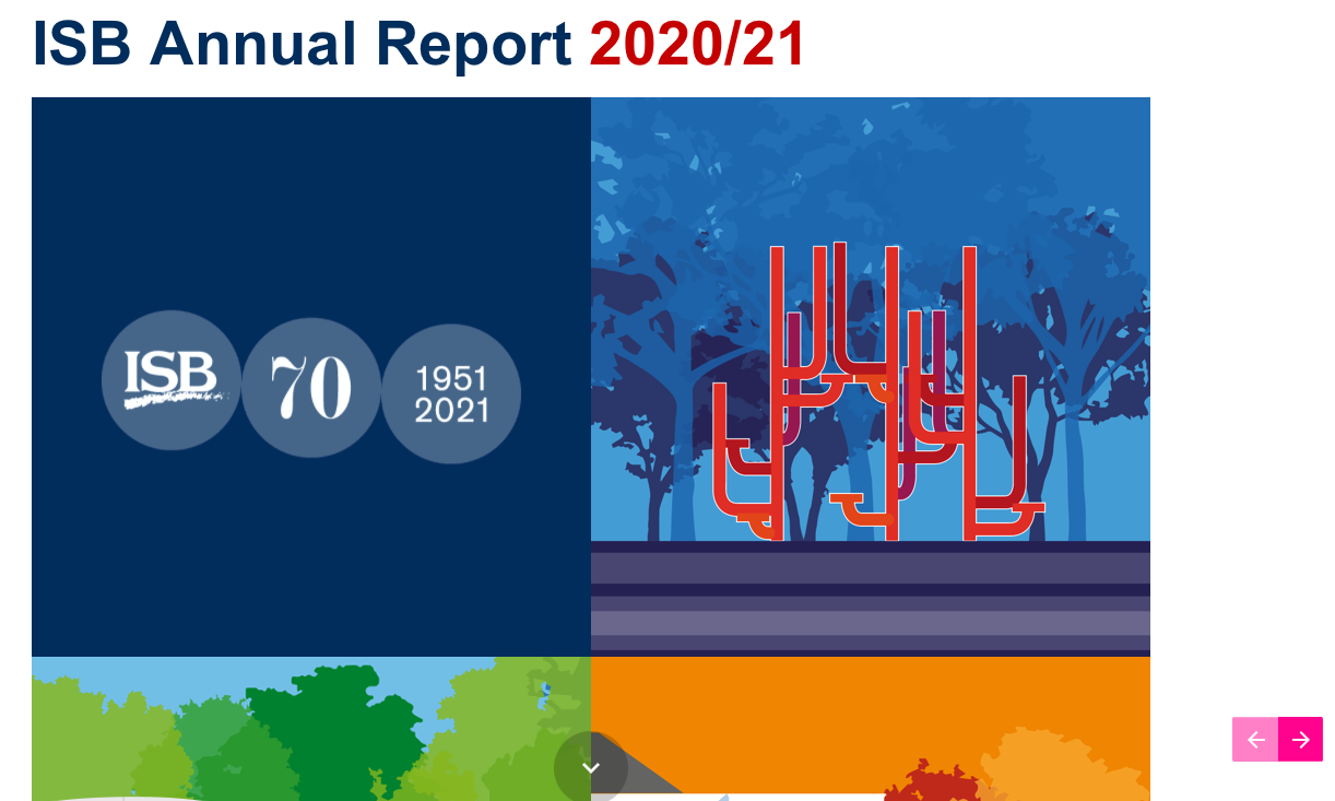
Examples: InspirED Brilliance Awards Winners
Bind Into the Magazine or Fly Solo
The jury is out on this one.
The Pros
Some (some) savings in mailing one piece vs. two
Delivery of one piece to your audience all at once instead of two pieces, often close together, which can look disorganized or poorly planned
Taking advantage of a captive audience who wants to read the magazine and will be forced to at least flip through the report, and vice versa
The Cons
Mixing the magazine which is friend-raising with the report which is fund-raising. (This is the “don’t have your hand out every time you communicate” camp.)
Pressure for teams to get both documents out at once
Ultimately, each school needs to decide what's right for them. Experiment one year and track results.
Examples: Annual Reports Incorporated Into Magazines
Donor Envelope or Give Online
Again, this is a generational thing, and the donor envelope will go by the wayside as soon as the Boomers are no longer with us. In another decade, folks won't even own a checkbook. For now, I suggest a donor envelope only for the older alums and friends.
Cover Design
Let's face it: "I can't wait to dig in and read 40 pages of people's names," said no one ever. So let's try to make the cover as compelling as possible and invite your readers in.
Photos of students are compelling for many, especially your current parents, faculty, and staff, but might not resonate as much with the widest audience. That said, the reason this report exists is to thank those who helped the students get a fabulous education at your school. Without students, this report wouldn’t exist.
Alternatives to students on the cover is a gorgeous (preferably professionally shot) image of an iconic place or feature of campus that spans the generations. It’s always great to have students in this kind of shot, just not as the focal point. The upside of this kind of cover is that it can produce feelings of nostalgia and motivate donors to give again (or for the first time).
These timeless kinds of shots are what you're going to want your professional photographer to take next time on campus. They're extremely useful, especially for development. (Need a great photographer? Check out our Photographer and Filmmaker Guide.)
No great shots? Use words instead. Like The Lovett School pictured here.
A Last Word on Design
If you know your audience is older folks, don't design your lists reversed on black, even if it does look cool and black is one of your school colors. It's murder on the eyes. (Says the senior.)
Your donor lists can be a smaller point size than the body text because folks can skim them, there's a lot of white space, and alpha order helps to find names quickly.
I think infographics are starting to reach their tipping point as far as freshness is concerned. Think of new and different ways of designing that information that isn't as cookie cutter (such as the two "Year in Review" examples above).
Here's hoping you met or exceeded your goal last year and will do the same this year...and you'll develop a stunning report to share the good news and gather more gifts.
If you like this post, you'll love our newsletter, the Daily Jolt. Sign up here.


Master Electrician, InspirED School Marketers
Master Electrician isn’t just a fun title for me. It’s how I feel about sparking school marketers to do their best work, connecting them to one another, and helping to make their jobs easier. After working with close to 100 schools in the firm I founded — Turnaround Marketing Communications — I realized that school marketers needed a place where they could find brilliant ideas and brain food and feel supported. InspirED School Marketers was born in 2013 to fill that void, and with the help of my fabulous Best Boy, Rob, we are on a quest to make InspirED a resource you can't live without.
Facebook LinkedIn