How To Create An Award-Winning Website Redesign: Woodward Academy
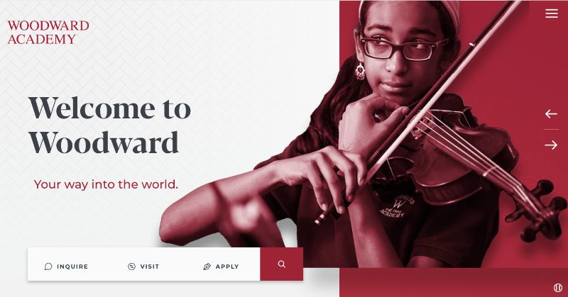
/Chosen because Woodward Academy won Silver for Website Homepage Redesign in the 2022 Brilliance Awards. Amy Zarriello Morris, Director of Strategic Marketing & Communications, told InspirED about the project.
“I adored this site. It does everything you want a homepage to do. It tells a story with persuasive, branded copy, it’s prospective-family centric, it gives you a clear picture of the school’s identity and the calls to action are spot on. Having never visited Woodward, I felt like I knew exactly ‘who it is’ just from the home page and it doesn’t look like it was borne out of a template. This is a home run.”
The Old Website Homepage (below)
“I’m so pleased with the end result [of the website] and grateful to the Marketing & Communications team for their dedication and hard work on this important endeavor that will bolster our admissions pipeline for years to come. The Brilliance Award serves as a well-deserved honor and recognition for envisioning, creating, and implementing a national model website.”
Set the Goal
Woodward Academy’s number one goal in its website redesign was to create a converting website that compelled its visitors to take action and convert those prospects into qualified applicants. The MarCom team also wanted to trim down the overall number of pages to bring the most relevant information for prospective families to the forefront, while also helping their overall SEO function.
“Our former site was simply ancient (more than 7 years old… a website eternity!),” says Amy Zarriello Morris, Director of Strategic Marketing & Communications. “We wanted to ensure Woodward stayed competitive in the Atlanta market by putting our best foot forward when people searched for private schools in our area.”
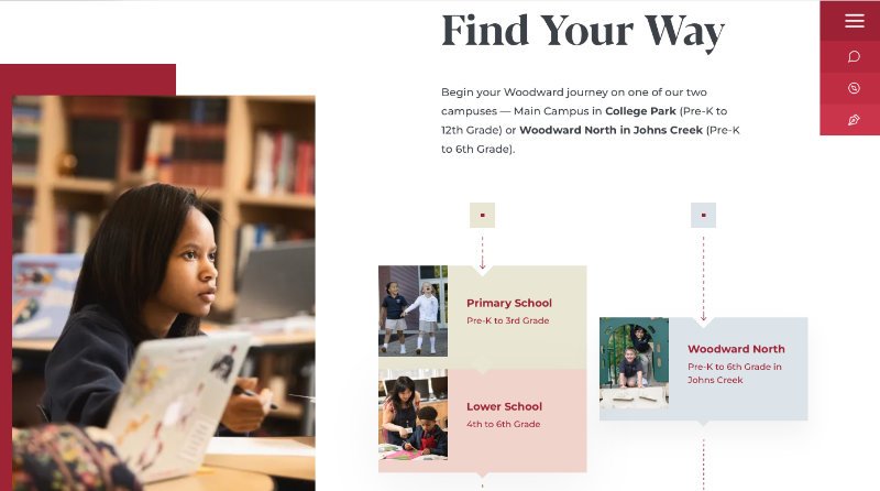
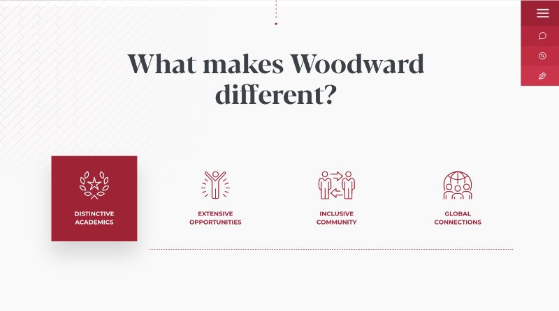
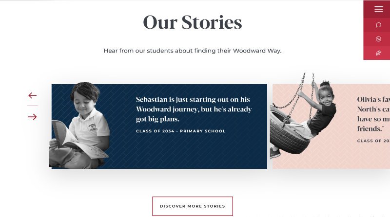
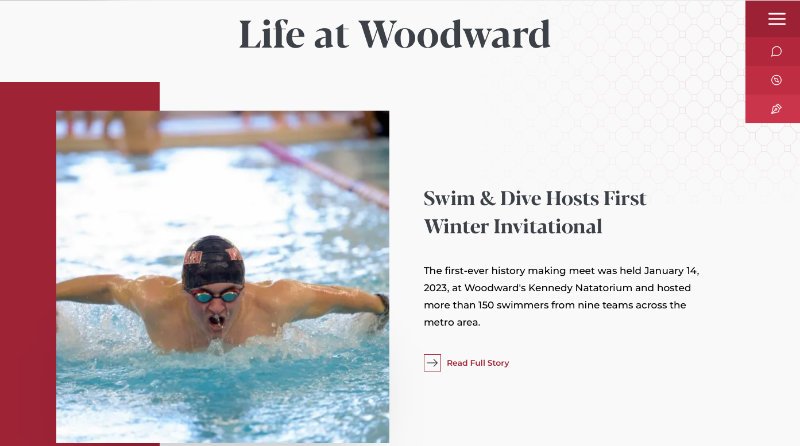
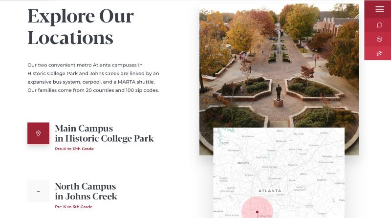
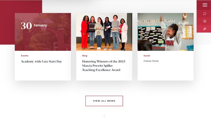
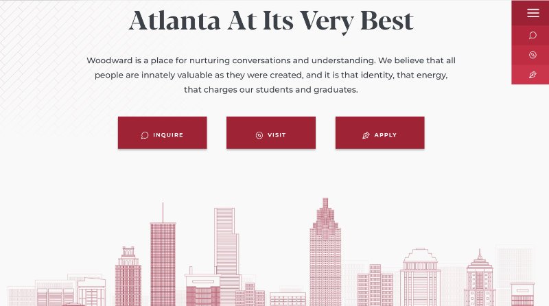
The New Website Homepage (below)
Know Your Audience
After meeting with the Admissions team and honing in on what prospective families are looking for, the MarCom team created a wireframe to deliver that information in an easy-to-navigate, logical way.
“We have five ‘divisions’ that we call ‘schools,’ so rather than having separate sections on Academics / Arts / STEM, we created school pages to cover the details relevant to that school,” says Amy. “We intentionally made it easy for the visitor to advance to the next school to see what lies ahead on the Woodward journey.”
Trim It Down
The school rewrote every line of text to speak conversationally to its audience and make it easier for prospective students and families to imagine themselves at Woodward. They also kept the text to a minimum while focusing on quality visuals and interactive elements to differentiate the site.
Create a Parent Portal
A big part of this project was moving all information relevant to current families to a Parent Portal as a one-stop resource for their needs including student progress reports, school calendars and announcements, teacher contacts, etc. “This allowed us to strategically delineate the needed space on the website for the prospective family experience—specifically to frame our value proposition directly on the homepage to draw in visitors,” says Amy.
“The Woodward website shows the end user a great deal on key facts and information on one page. You can learn so much without having to dig too deep. Very good visuals and branding.”
Pick a Provider… Then Have The Pandemic Destroy Your Schedule
After investigating alternative open-source solutions, the MarCom team decided to keep the site with their current provider, Finalsite, for the ease of use, support, and longevity the CMS offers.
Amy says, “Initially, we had planned a redesign for the fall of 2020 after conducting a brand refresh, but all of that was delayed due to COVID.”
The schedule turned out like this:
Fall 2021: Hold brainstorming and pre-planning meetings.
January 2022: Kick off the redesign project with Finalsite.
September 2022: Launch the new website.
The silver lining in the COVID delay was that the school reserved and earmarked monies over a couple of additional years that allowed them to select the top-tier design package with Finalsite. They felt their $55k budget was sufficient to achieve all the features, functionality, and design they wanted.
Celebrate Results
The new homepage has yielded tremendous results including:
increased average time visitors spent on the site (who also go deeper to explore internal pages)
lowered site bounce rate
increased growth in prospective family site users
improved goal conversation rates (having users take one of the inquire / visit / apply calls to action)
resolved 404 errors and
enriched mobile-friendly experience
Anecdotally, the administration hears that visitors have an easier time finding what they’re looking for, learning how students can begin their Woodward journey on either campus, and accessing the range of offerings and opportunities that make Woodward different.
“We hear the Our Stories section featured on the homepage is a fan favorite!”
Advice for Others
For others taking on a website redesign, Amy suggests, “Allow plenty of time, and don’t rush the process! Be very thoughtful and intentional about your new site and what should exist there (or not). Make sure you have a clear idea of what you’d like your new site to be and find examples to help steer you toward a solution that works for your school. It also really helped us—and Finalsite—to identify sites we did not like.” And if you are partnering with a website provider, Amy encourages you to be brutally honest with your feedback and revisions. Amy believes that the more open and honest you are with your feedback, the better your product will be.
Congratulations, Woodward Academy! You are brilliant!
TEAM
Amy Morris, Director of Strategic Marketing & Communications
Shaumond Scott, Marketing Strategist
Kyana Johnson, Digital Communications Specialist
Marla Goncalves, Marketing & Engagement Director
Steven Averett, Editorial & Creative Manager
Nija Meyer, VP for Enrollment Management
Want more brilliant ideas and brain food to make your job easier? Sign up here.




![How To Create An Award-Winning [Anniversary] Magazine: Cardigan Mountain School](https://images.squarespace-cdn.com/content/v1/57532abf27d4bd17be970a61/1648569270513-JR73OVUH159CUU8B5CU9/14Cardigan.jpg)


