How to Create An Award-Winning Cover Design: Woodward Academy
/Chosen because Woodward Academy won Gold for Magazine Cover Design in the 2023 Brilliance Awards. Steven Averett, Editorial & Creative Manager, Woodward Academy, told InspirED about the school’s win.
“These magazine covers were a joy to behold! Reworking the masthead with each issue is not considered “on brand,” but in this case, reinvention becomes a defining element. Each cover is relevant to that particular issue through color, typography, imagery, and style. The boldness and ideas that shine through are exciting. I want to see more!”
Step 1: Decide to be Different
Steven Averett, Editorial and Creative Manager at Woodward Academy explained, “Overall, we try to be cognizant of cover designs that 1) best represent our school and its mission, 2) are fresh and non-repetitive, and 3) drive conversation. These three covers demonstrate that range of goals and were informed by the theme of each issue.
Step 2: Conceive Three Covers
For the winter 2022 issue, centered around compassion, Woodward Academy wanted to depict a “map of compassion” to show the different ways compassion was being demonstrated across the campus. The wraparound freelance illustration of the Woodward campus includes iconography as shorthand, which is expounded upon in the key on the inside back cover. The printer employed a special treatment that raised the black line art, giving it a pleasing textural quality.
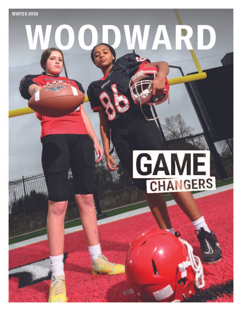
The theme of the summer 2023 issue was “game changers,” and from their earliest editorial meetings Woodward had a concept of their ideal cover. “The idea centered around one story about two middle school girls who play on the otherwise male-populated JV football team,” says Steven, “which is part of a larger story about the 50th anniversary of Title IX.”
“The winter 2023 issue was a daunting one, cover-wise,” says Steven, “as the issue itself focused on two seemingly disparate topics: the rise of AI in education along with a discussion of building empathy and social-emotional learning into school curriculums.” Woodward’s designer worked with the school to source an illustrator who could capture the intersection of these two topics that profoundly impact education.
Step 3: Mind the Budget
Illustrated covers tend to be the most expensive for Woodward, with illustrations generally running in the $2,000 range, plus designer costs. They briefly considered a foil-type treatment for the “Ghost in the Machine” cover but eschewed it to keep the budget in line.
Step 4: Execute the Designs
The two illustrated covers were created by freelance illustrators. Woodward began by describing the themes of those issues to their freelance designer, Heather Winkel, who knows their brand intimately. Steven says, “We agreed in each case that illustration was the best approach, and then she sourced four or five illustrators whose work best fit those themes. Once we selected the candidate and agreed to terms, Heather acted as go-between as we refined initial concepts into the final designs.”
For the Game Changers cover, plans included asking the girls to participate, facilitating the shoot (which involved getting uniforms out of storage in the offseason), and getting the perfect shot with photographer Paul Ward. “It rained off and on during the shoot,” says Steven. “But Paul had no qualms about laying out on the wet turf to get the right angle with the leaden sky adding frisson.”
Photographer Paul Ward at work.
Step 5: Listen to Community Response
The covers garnered a lot of attention for diverging from traditional school magazine covers (including some of Woodward’s own legacy covers). The “Game Changers” cover generated some pushback from more conservative quarters, only to end up garnering universal praise from the community.
Step 6: Take Pride in Your Brilliance Award Win
“It was incredibly validating to see our work recognized,” Steven says, “Especially since the judges seemed to understand what we were going for in terms of designs that try to reach beyond typical school magazine covers while still being true to our brand. It has encouraged us to keep working in that vein and pushing the creative envelope with our magazine.”
“So proud for and of MARCOM!” –Stuart Gulley, President
“Much deserved! Kudos to the team!” –Dr. Nigel Traylor, Vice President for Academic & Student Life
“CONGRATS and so well deserved!” –Chris M. Freer, Ph.D., Vice President for Advancement
Step 7: Advice for Small Shops
“Keep your audience in mind, but don’t be afraid to think big (even with a modest budget to execute said idea). Also, don’t become beholden to tradition/conventional thinking. For instance, playing around with your masthead every so often can reinvigorate your brand.”
Congratulations, Woodward Academy! You are brilliant!
TEAM
Amy Morris, Woodward Academy, Director of Strategic Marketing & Communications
Steven Averett, Woodward Academy, Editorial & Creative Manager
Heather Winkel, Heather Winkel Creative, freelance designer
Did you win a Brilliance Award and want to be featured on the By Example case study blog? Send in your questionnaire or ask Liza for another one to get the process started.
Want more brilliant ideas and brain food to make your job easier? Sign up here.


![How To Create An Award-Winning [Anniversary] Magazine: Cardigan Mountain School](https://images.squarespace-cdn.com/content/v1/57532abf27d4bd17be970a61/1648569270513-JR73OVUH159CUU8B5CU9/14Cardigan.jpg)


