2019 InspirED Brilliance Awards
Category No. 2: Enrollment/Admissions Package
Zehno for
Ursuline Academy of New Orleans
New Orleans, LA USA
Grades T2-12, Girls Day
SAMPLE JUDGES' COMMENTS
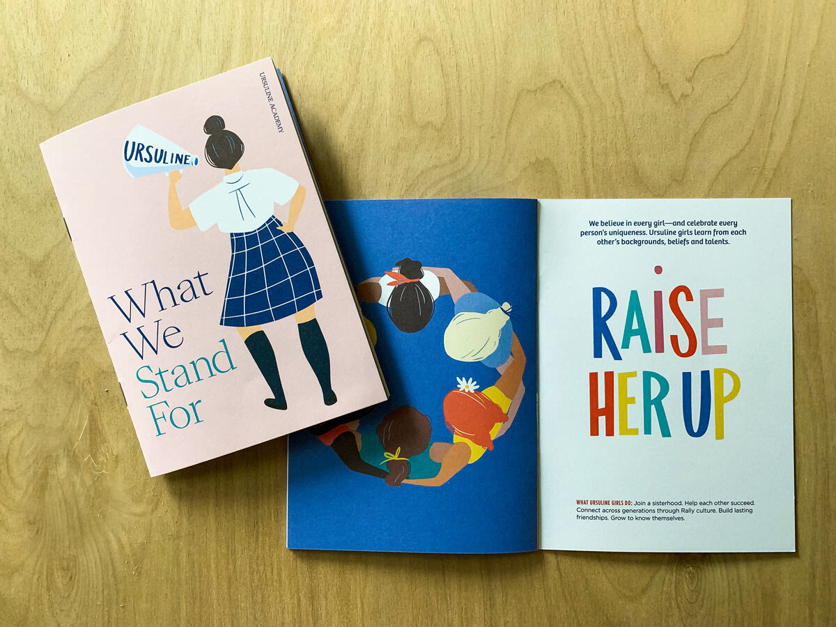
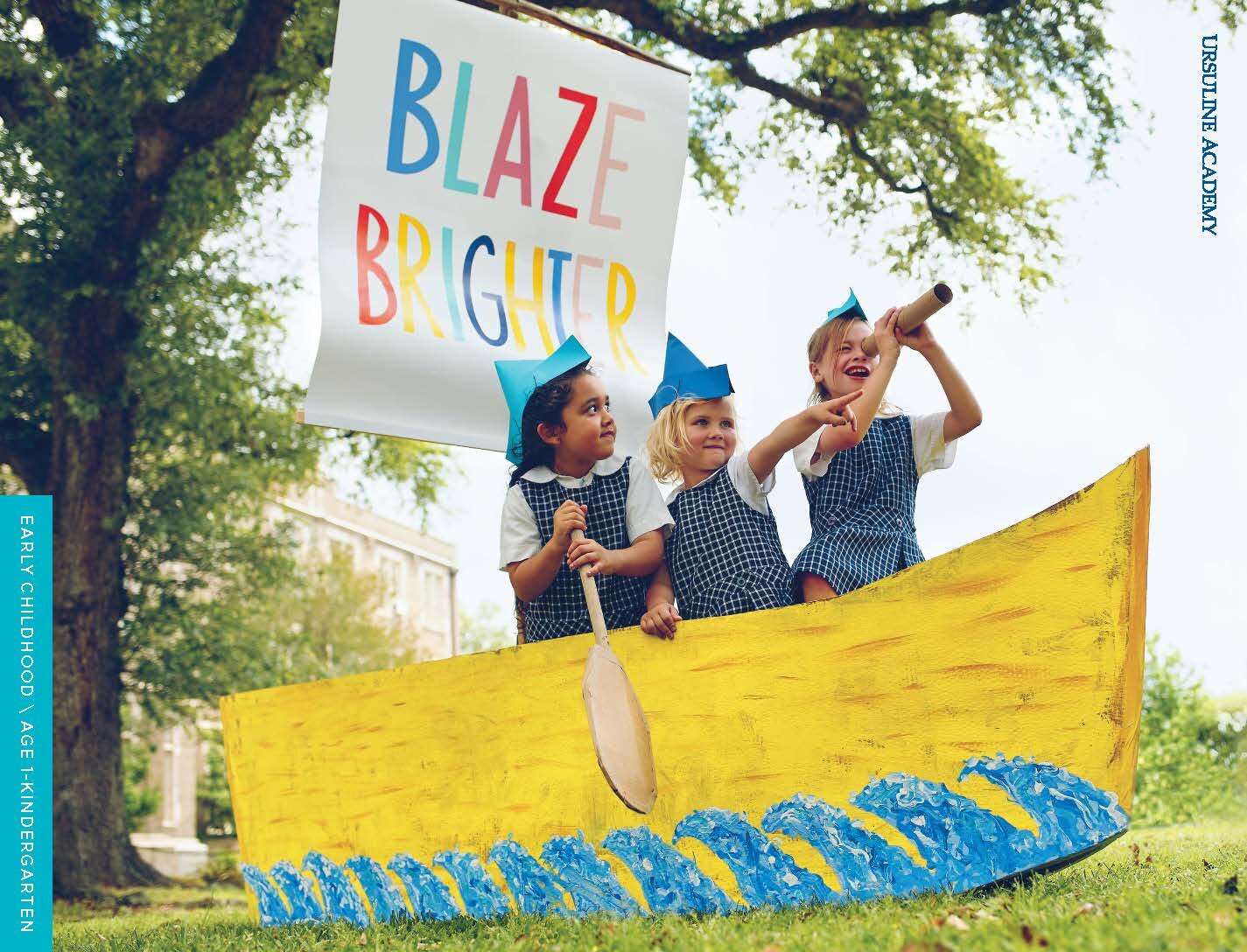
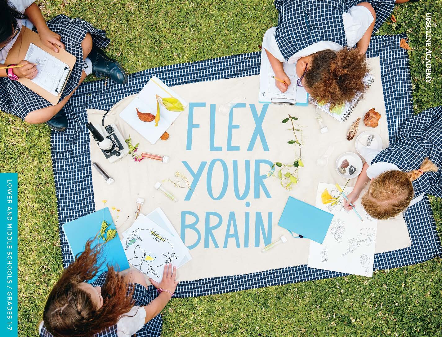
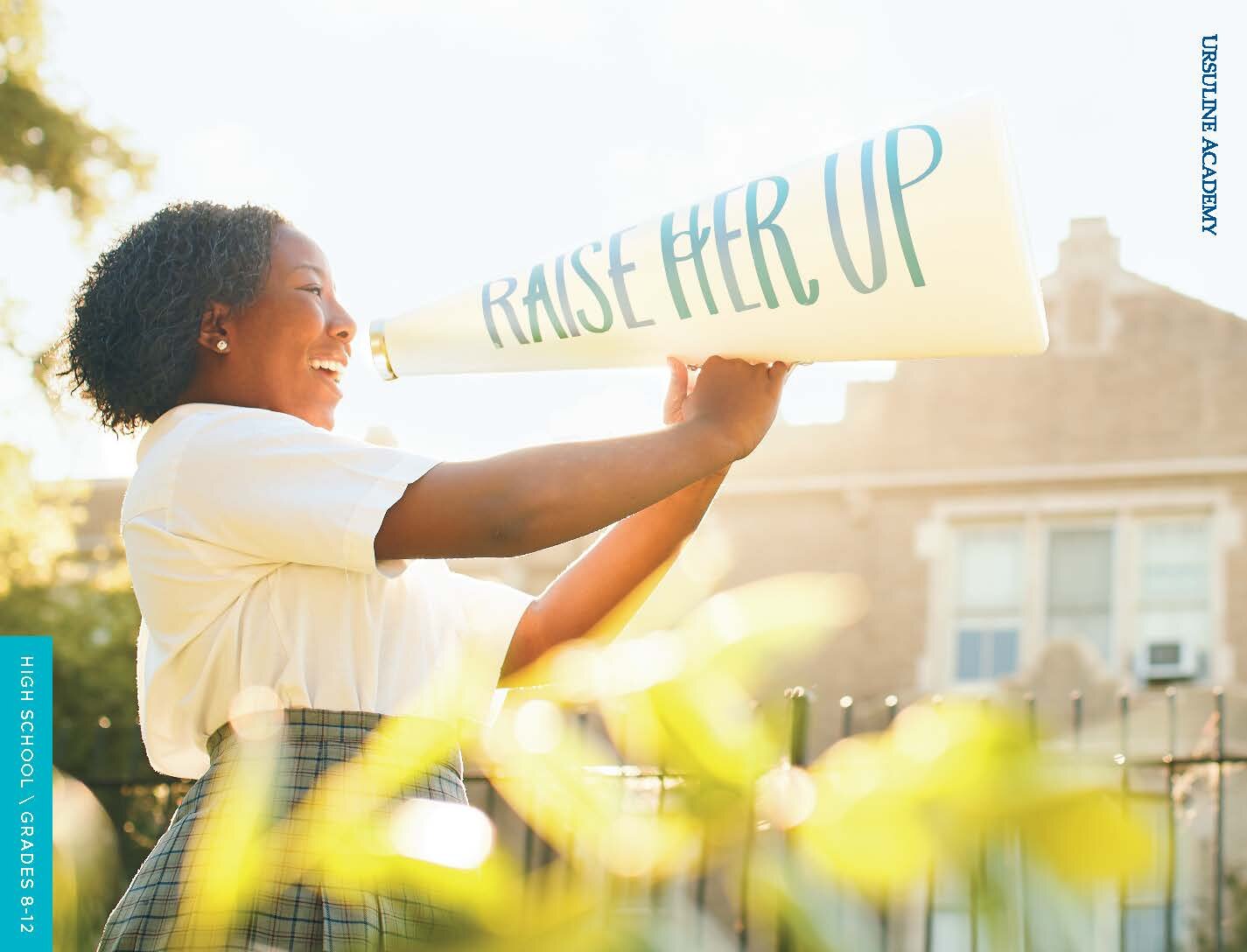
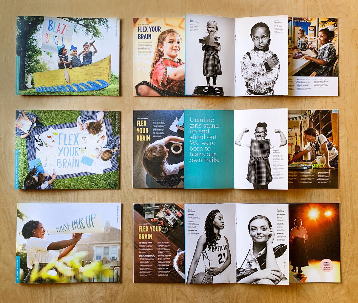
WOW! Everything about these pieces is impressive and compelling—from the copy to the '“Raise Her Up” tagline to the illustrations and photography. The color palette is very warm, friendly, and inviting.
"What trail will your girl blaze?" From the inspirational messaging, to the unique approach to photography, to the wonderful illustrations and graphics, this entire package made me KNOW this school. And it made me want to know more. Every time I opened a piece of the package, I became more and more impressed.
Great unification all the way through on these elements! I really love the design of the pieces — the photography is fantastic and the overlays of the taglines are really great! I the love the "What We Stand For" piece.
TEAM
Lauren Sanders, Art Director
Mary Louise Killen, Senior Designer
Shane Shanks, Editorial Director
Megan Youngblood, Editorial Manager
Kathy Cain, Creative Director
Jerrell Fudicker, Creative Director/Producer
Jonathan Chapman, Photography/Video
Daymon Gardner, Photography
Mary Sullivan, production/designer
Margie Tillman, Illustrator
Heather Weaver, Microsite Developer
Rachel Wilson, Video Scriptwriter
CEH Design, Inc. for
Millbrook School
Millbrook, NY USA
Grades 9 -12, Coed Boarding and Day
SAMPLE JUDGES' COMMENTS
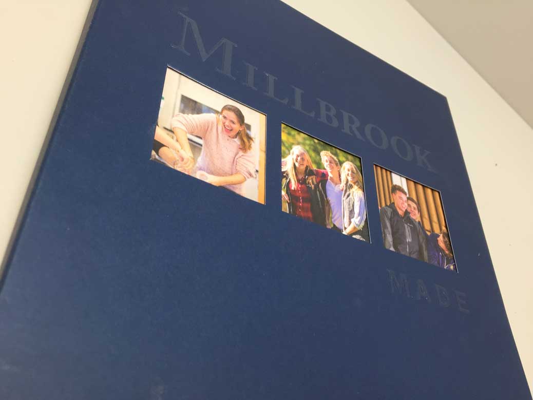
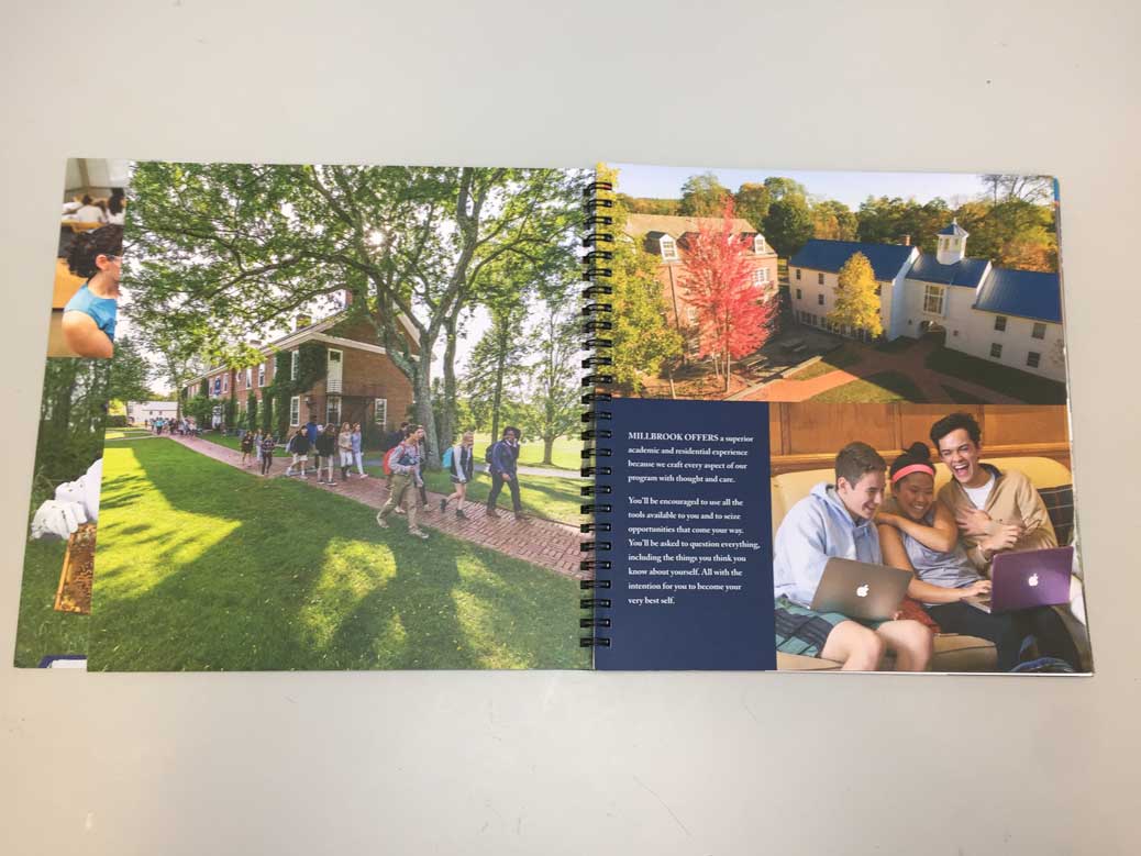
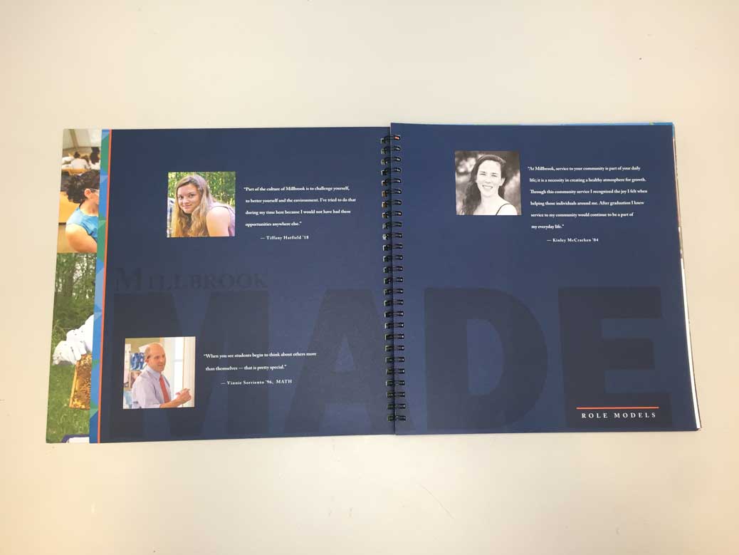
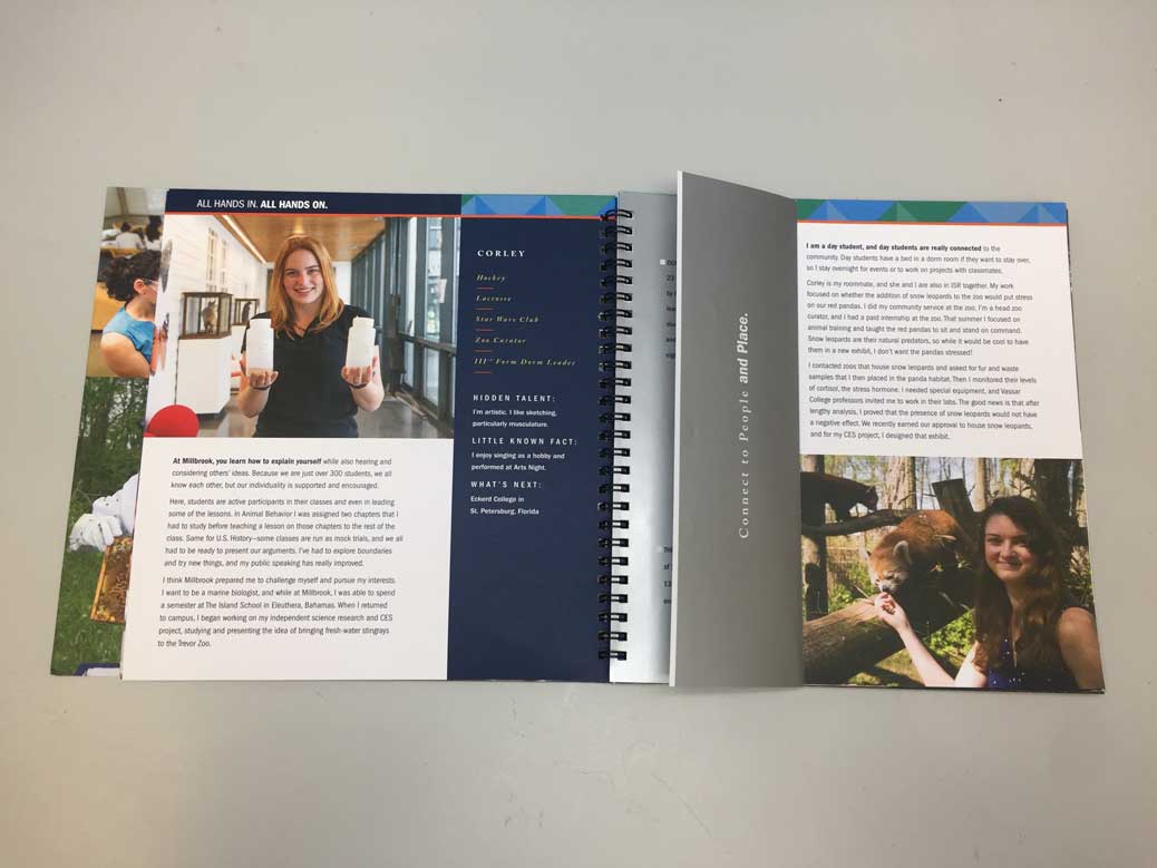
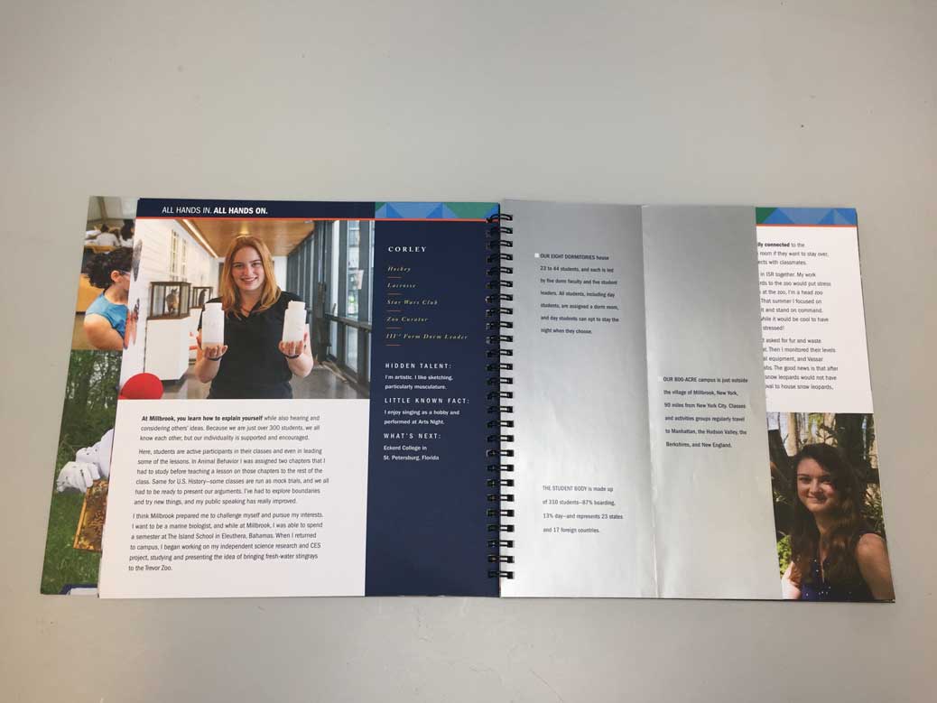
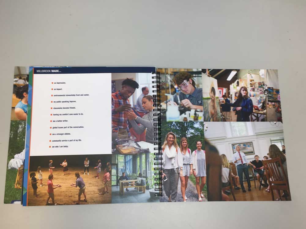
What is not to love here? The 360 perspective told through all of the school's constituencies through profiles, quotes, information, impact. This school is not afraid to say they're the best and the total package for every kind of kid and it shows. Bold tagline! I love the interspersed factoids and inserts. The photography is amazing and the students don't look staged and look genuinely happy, with lots of diversity evident in them.
Beautiful package with impressive design and photography. Copy gave me a sense of place and community, and the little touches (the YES! YES! YES! on the tear-off tab) made it even more unique and welcoming.
Comprehensive, yet clean and engaging. I want to go back again and experience a different "story" from a different perspective. The focus on students and faculty makes this community come to life.
TEAM
Carolyn Eiseman, Creative Director
Siobhan Federici, Writer
CEH Design, Inc. for
Pomfret School
Pomfret Center, CT USA
Grades 9-12, PG, Coed Boarding and Day
SAMPLE JUDGES' COMMENTS
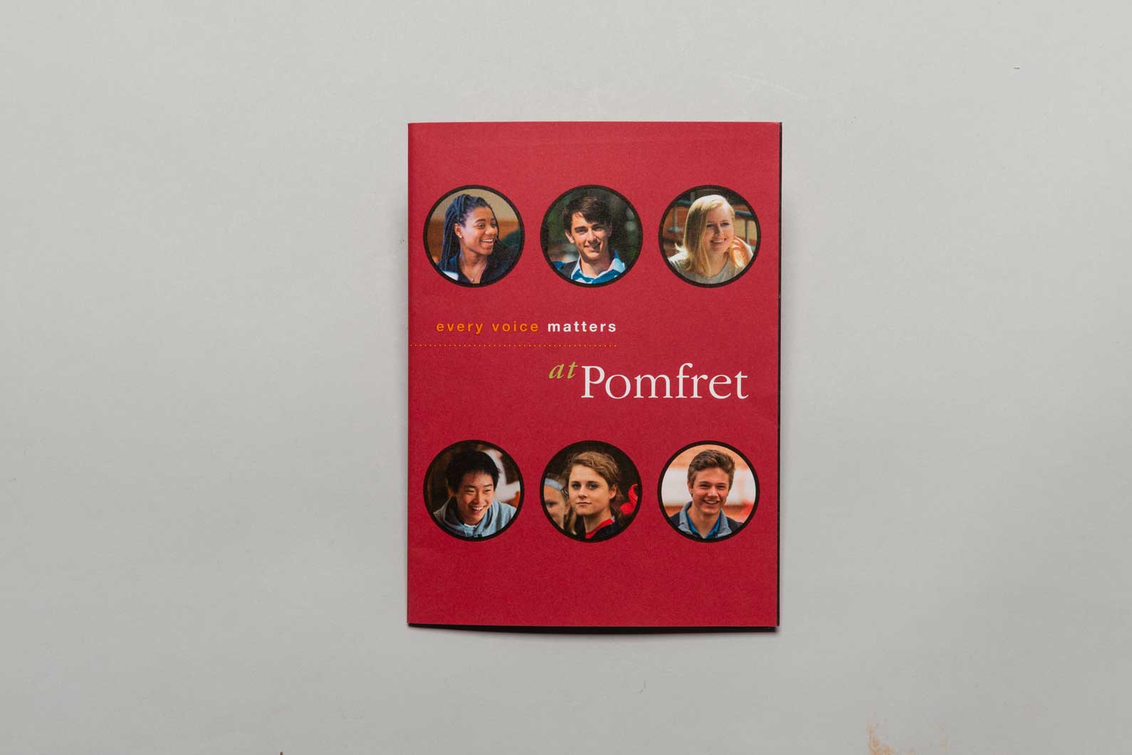
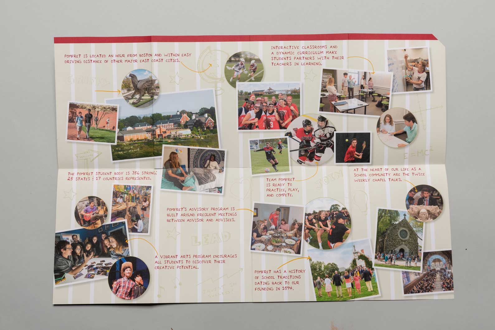
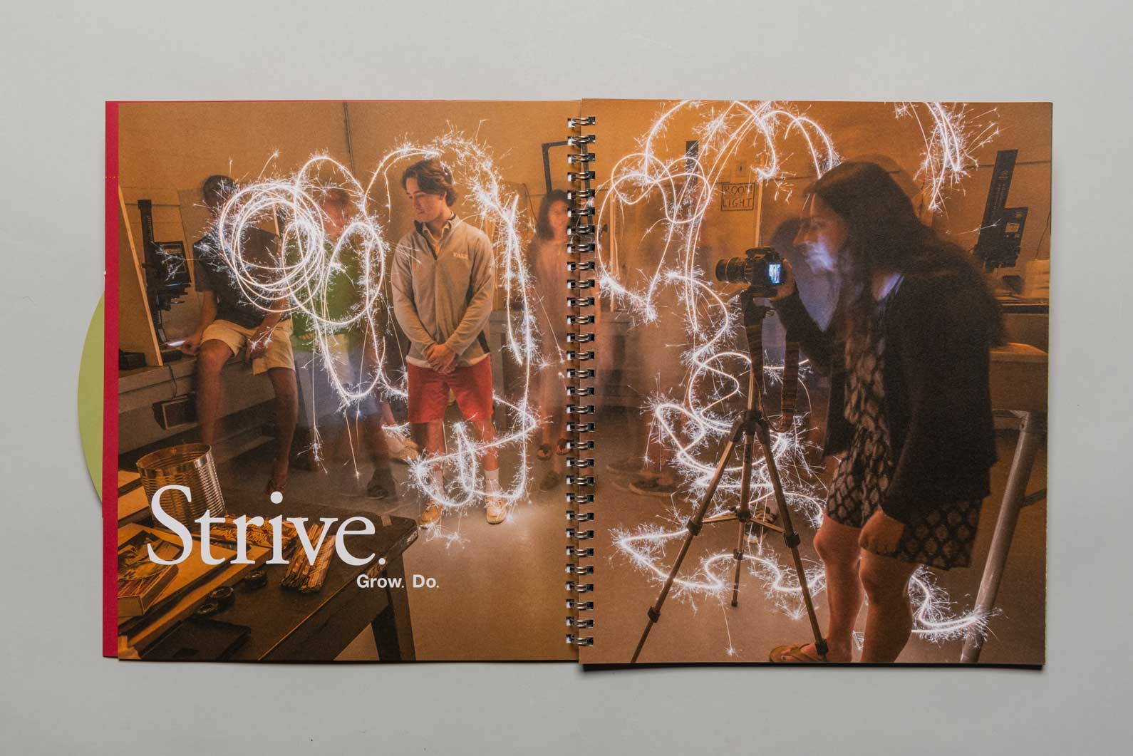
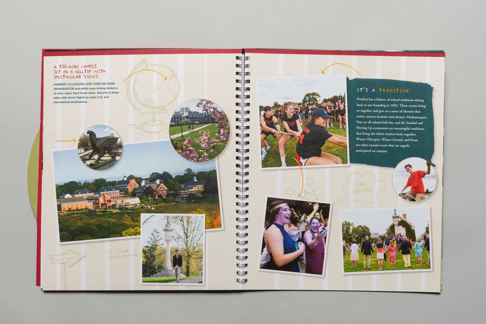
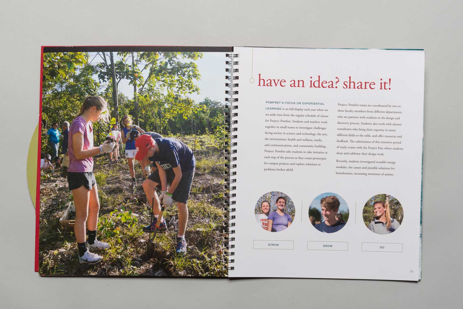
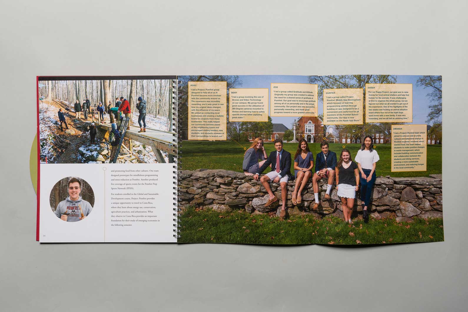
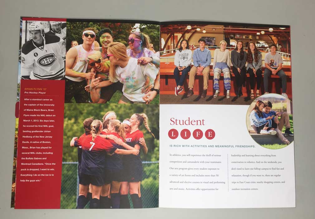
I think it is important that a boarding school conveys what life is like on campus and I think this piece does a very good job. I like that they include sample schedule and a feel for the expanse of opportunities available on campus. They have just enough testimonial information and concrete information about the programs. They do an especially nice job of flushing out those programs that make them different. And they are unique. The fact that they have an observatory on campus is pretty cool.
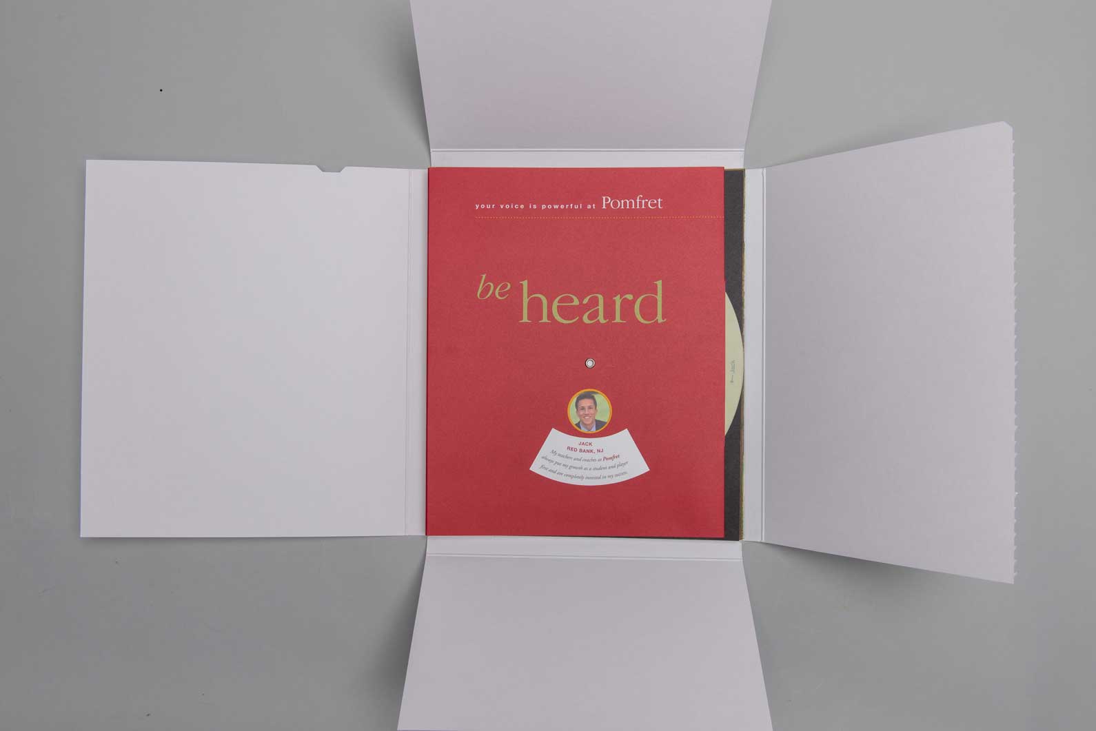
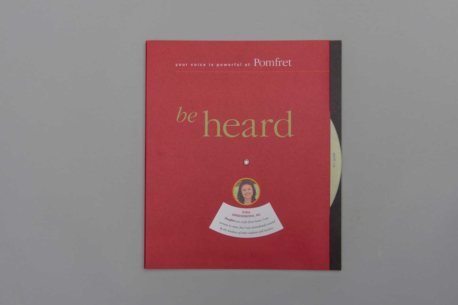
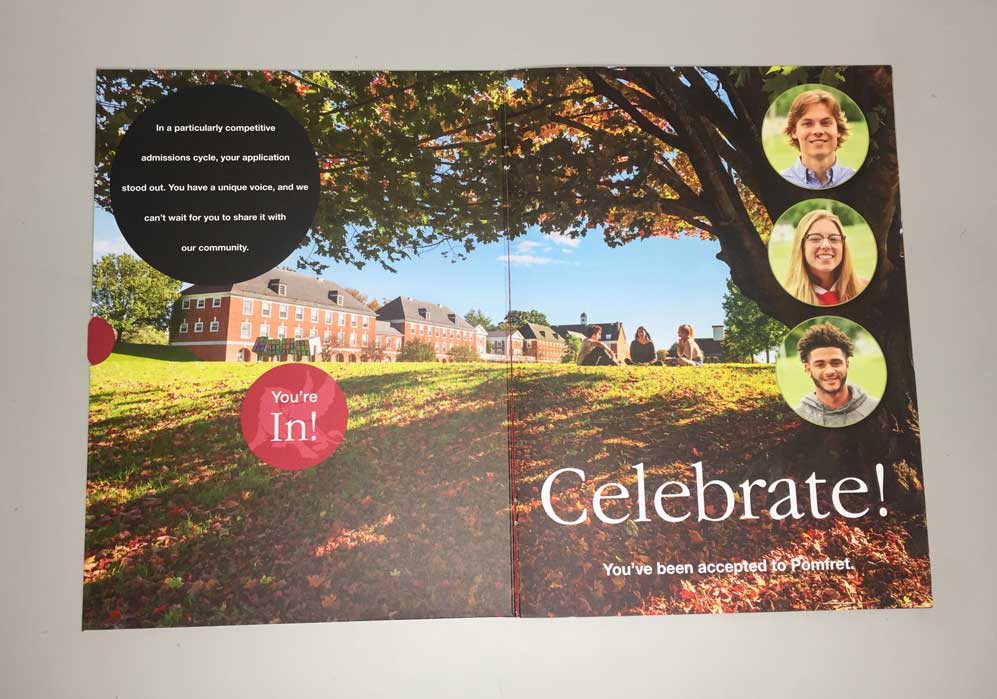
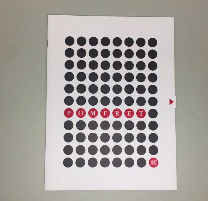
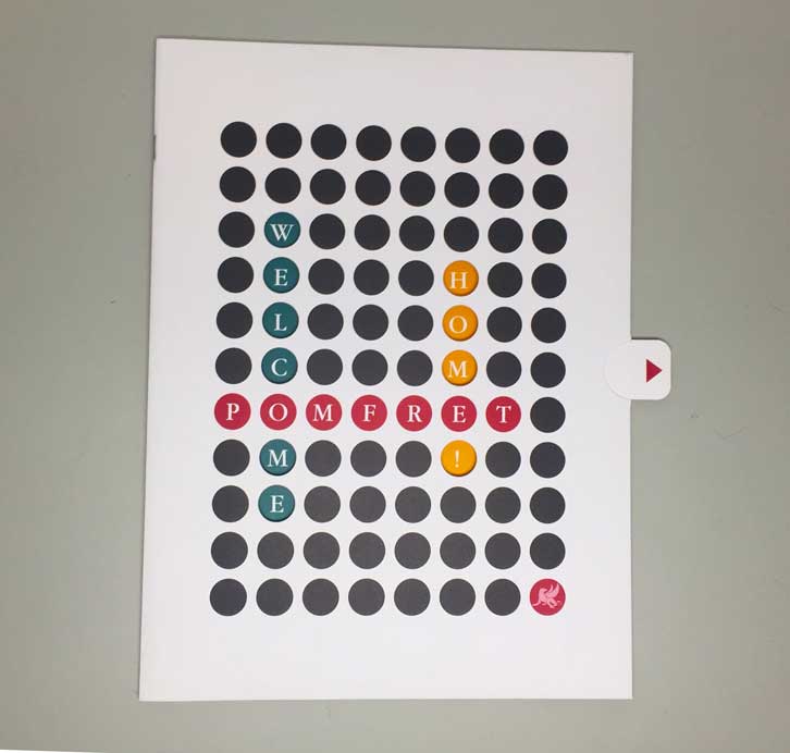
Amazing in every way. Bravo! I love the peekaboo front of the acceptance piece and the mini-pennant inside and the exciting envelope! It's clear that students are in charge of their own experience here and that that model is supported. I really like the portrait of a graduate information combined with the matriculation list.
Design, content, and copy would connect with prospective students and parents, and also probably send a emphatic reaffirming reminder to current families why they chose this school. Very engaging.
TEAM
Carolyn Eiseman, Creative Director
Katherine Towler, Writer
Jordan Kempain, Illustrator
Jim Gipe, Photographer
Lindsay Lehmann, Photographer


