2017 Brilliance Awards Website Winners
Category No. 13: Homepage, Outsourced
COMMUNITY SCHOOL
Sun Valley, ID • PK-12, Coed Boarding and Day
SAMPLE JUDGES' COMMENTS
I felt that the videos and photography told me more about life at Community than all the copy combined. Well done on using rich media to really communicate the distinctiveness and the beauty of the school. I also thought that the use of typography was outstanding. Nice job!
Fantastic job visually showing the culture of the school. Immediately through the opening video, you get a sense of what this school is all about, what matters, and the opportunities available to your children without ever having to make a click. Clean, simple, visually stimulating.
The opening visuals and video immediate draw any curious mind into the world of the Community School and in an instant, it is easy to see that this is a school that places great value on cutting-edge education, strong community connections, and active lifestyles. Visually rich and strong messaging, Community School has done an exceptional job conveying its value to any interested family.
SILVER
MILLBROOK SCHOOL
Millbrook, NY • 9 -12, Coed Boarding
SAMPLE JUDGES' COMMENTS
I was completely absorbed by the Millbrook experience from the first second my eyes glanced upon the homepage. Not only is the visual design and storytelling breathtaking and clearly impactful, the way Millbrook highlights their unique and differentiated programming is extraordinary. I found the Energy Dashboard to be especially unique and engaging. In a very interactive way, I was able to quickly learn about the school’s dedication to environmental stewardship as a key part of the mission.
Really liked the "magazine" feel of the website. I found the home page scroll very engaging and enjoyed the creative "stagger" of the elements. I found your design outstanding and the overall appeal the highest scores I gave out. I also thought your copy was tight and well organized. Well done!
Wow! The photos are spectacular and capture the viewer! I also like that you kept the copy short and sweet. A beautiful website with beautiful visuals.
BRONZE (TIE)
GERMANTOWN FRIENDS SCHOOL
Philadelphia, PA • Grades K-12, Coed Day
SAMPLE JUDGES' COMMENTS
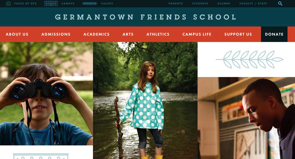
Really liked the graphic design, typography, and overall feel of the site. It had a very unique vibe out of all of our entries. I especially liked the typography and the ease of reading on the screen. I also really liked the little details that were throughout the site...slight icon animations on the values page, the way you presented the campus, and the journalistic "Faces of GFS." Well done!
I really like this design and the clickable boxes, and the way it is organized is very family friendly.
BRONZE (TIE)
GEORGETOWN VISITATION
Washington, DC • Grades 9-12, Girls Day
SAMPLE JUDGES' COMMENTS
The rotating videos with the pop-up bookmarks are a fun touch to the home page. I especially love the vibrant footer, a page element that is often overlooked. Lots of great content, organized in nice sections. Solid collection of news, vital when it‘s a feature of the homepage. Overall, an engaging page.
Category No. 14: Homepage, In-House
PRESBYTERIAN DAY SCHOOL
Memphis, TN • 2 Years-Grade 6, Boys Day
SAMPLE JUDGES' COMMENTS
Their expertise really jumps out at you. Very playful site that is easy to understand, skim and read. The playful theme goes great with their niche.
Your brand is really punchy, and you use it well.
Love the connection to boys as audience...right up front and clear. User experience is great as you scroll down on the site. Brand comes across strong.
Love this site — playful, surprising, clear, energetic, effective. Really like how the drop downs work in primary navigation.
SILVER
FRIENDS SEMINARY
New York, NY • Grades K-12, Coed Day
SAMPLE JUDGES' COMMENTS
Very smart site. As you explore you keep discovering gems.
You say so much with just a good sentence and your logo set in good design at the top. Love the photography on the slider. Beautiful infographics.
Love the use of color. Diversity of experience is told through the scrolling header news items. Infographics provide a lot of information in digestible format.
Great home page. Text intensive but graphically appealing and very informative. Good primary navigation.
BRONZE
GIRLS PREPARATORY SCHOOL
Chattanooga, TN • Grades 6-12, Girls Day
SAMPLE JUDGES' COMMENTS
Love the header and primary photo (above fold) graphic design. I found the "hamburger" navigation easy to access and easy to get where I wanted to go. Visual identity aligns with target audience nicely.
Love the overall look of this website. Nice and clean. Great use of color. The navigation is clean and easy to use. The photography is great! The overall layout sets it apart from the rest. It appeals to the demographic well.
Tons of great information, nice photography, impressive statistics, good primary navigation.
Category No. 15: Single Web Page Or Microsite Homepage
TAFT SCHOOL
Watertown, CT • Grades 9-12, Coed Boarding and Day
SAMPLE JUDGES' COMMENTS
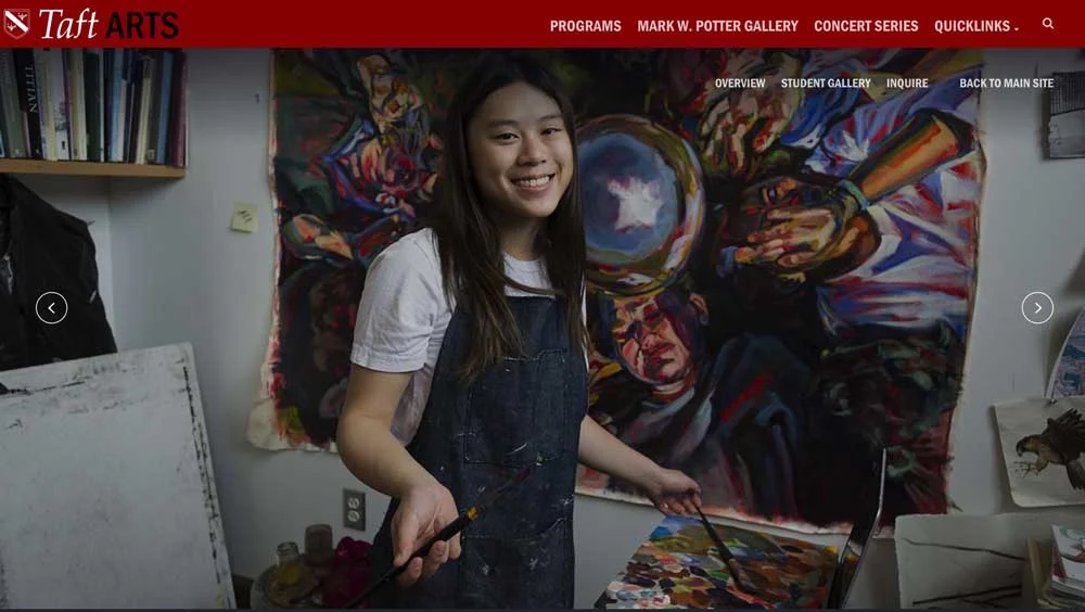
The opening page felt artistic as I scrolled through the disciplines of the department. Each click revealed the depth of their program on more traditional pages, but the artistic sensibility permeated throughout the site.
A beautiful microsite filled with large images that stretch full-width. The functionality is very slick and makes scrolling through the page feel like an adventure.
Exciting visuals to accompany exciting subject matter! Love the scrolling design with the changing backgrounds.
Amazing use of visuals to convey a whole of exciting opportunities. You'd really want your child to experience these.
SILVER
MISSION MINDED FOR MARIN ACADEMY
San Rafael, CA • Grades 9 -12, Coed Day
SAMPLE JUDGES' COMMENTS
Marin Academy has taken the staid strategic plan and created a digital piece that effectively communicates the details of the plan in an interesting and engaging way. I loved the way that the icons for the elements of the plan echoed the school's logo, and the simplicity of transitioning from element to element.
The design is beautiful. What really captivated me was the site's organization, functionality and simplicity.
Very well-organized to provide a clear understanding of the strategic plan. It balances a modern feel with a warm approach. The copy is well-written and perfectly condensed.
BRONZE
STUART COUNTRY DAY SCHOOL
Princeton, NJ • Grades PK-12, Girls Day
SAMPLE JUDGES' COMMENTS
A great idea that obviously achieved its objective.
Stuart’s "Lead Like a Girl" conference page has a beautiful, colorful header that makes the viewer want to continue reading, and the black and white photography for the keynote speakers felt iconic. The layouts were clean and crisp.


