Category No. 14: Website, Outsourced
Interactive Schools for
Queen Anne’s Caversham
Caversham, UK
Ages 11-18, Girls Boarding and Day
SAMPLE JUDGES' COMMENTS
Not only did the photography blow me away to start with, but the powerful quote from a student really sold me. I also love how you set up the branding: Kind Hearts, Strong Spirits, Fierce Minds, and then proved it immediately with photography, content, and social proof. Also loved the use of your social media as another form of social proof. Congratulations!
The boldness, paired with the simplicity, was perfect. Striking imagery, strong headlines, user-friendly design, this website is a delight.
Beautiful, original photography, organized well around mission/brand, copy that's persuasive and to the point.
Queen Anne's site is elegant, features outstanding photography, clean navigation, and concise copy against a canvas with just enough white space, all with the best home page in the category.
TEAM
Tim Weaver, Creative Director
Ben Lutteman, Senior Designer
Simon Noakes, Founder/CEO
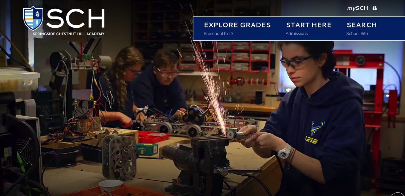
Springside Chestnut Hill Academy
Philadelphia, PA USA
Grades Pre-School-12, Coed Day
SAMPLE JUDGES' COMMENTS
Brilliantly original and creative home page images draw you in and then the design and copy provide an experience that persuasively defines and differentiates the school.
TEAM
Julia MacMullan, Associate Director of Communication & Marketing
Karen Tracy, Director of Communications & Marketing
Kayla Farrer, Marketing and Communications Specialist
Ryan Nolan, Finalsite Client Success Manager
The Mastery School of Hawken
Cleveland, OH USA
Grades EC-12, Coed Day
SAMPLE JUDGES' COMMENTS
I was captivated by this website right away -- the red thread grabbed me and led me through the school's unique philosophy and persuasive point of view. More schools should take such a bold stance!
Visit this site and you will understand exactly what differentiates Hawken. With lots of creativity and originality and well-written copy, the website is very persuasive.
I love the red thread! It was clear quickly how unique the Hawken School would be for students and how it really was defined differently. The use of the animated thread got that across and lead my eye to the messaging that you had to persuade the user. The overall appeal was tremendous and the copywriting spot on. Congratulations on a well-done site!
TEAM
Terry Dubow, Director of Special Projects
Julia Griffin, Director of the Mastery School of Hawken
Scott Looney, Head of School
Noformat, Design


